Strategy and guideline to use MDB Corporate Logo
The visual identity of any organisation is a reflection of its own individuality and uniqueness. Therefore, a visual identity is what makes a company unique, translated into a coherent and strong combination of colours or typefaces. Corporate logo is a vital visual element of an organization and considered to help set foundation for all promotional materials.
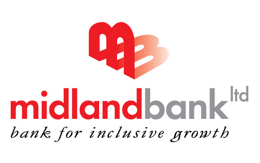
Midland Bank Limited (MDB), a new generation financial institution in the country, is using an attractive logo from the very beginning of its inception. Our general logo shape will be as under, where logo “M” is in the top-middle alignment with “midlandbankltd” :
Logo "M" in the top-middle alignment with bank name
Logo "M" in the base alignment with bank name
However, when we will use our logo along with other Banks, or Financial Institutions, or use in Crest or Press Ads, we will place our logo “M” in the base line with “midlandbankltd“, as below:

In view of the above, all are requested to follow the instruction before using MDB Corporate Logo in both shapes, such as “M” in the top-middle alignment with “midlandbankltd” and “M” in the base line with “midlandbankltd“, as and when required.
Download
Logo “M” in the top-middle alignment with bank name
Logo “M” in the base alignment with bank name

